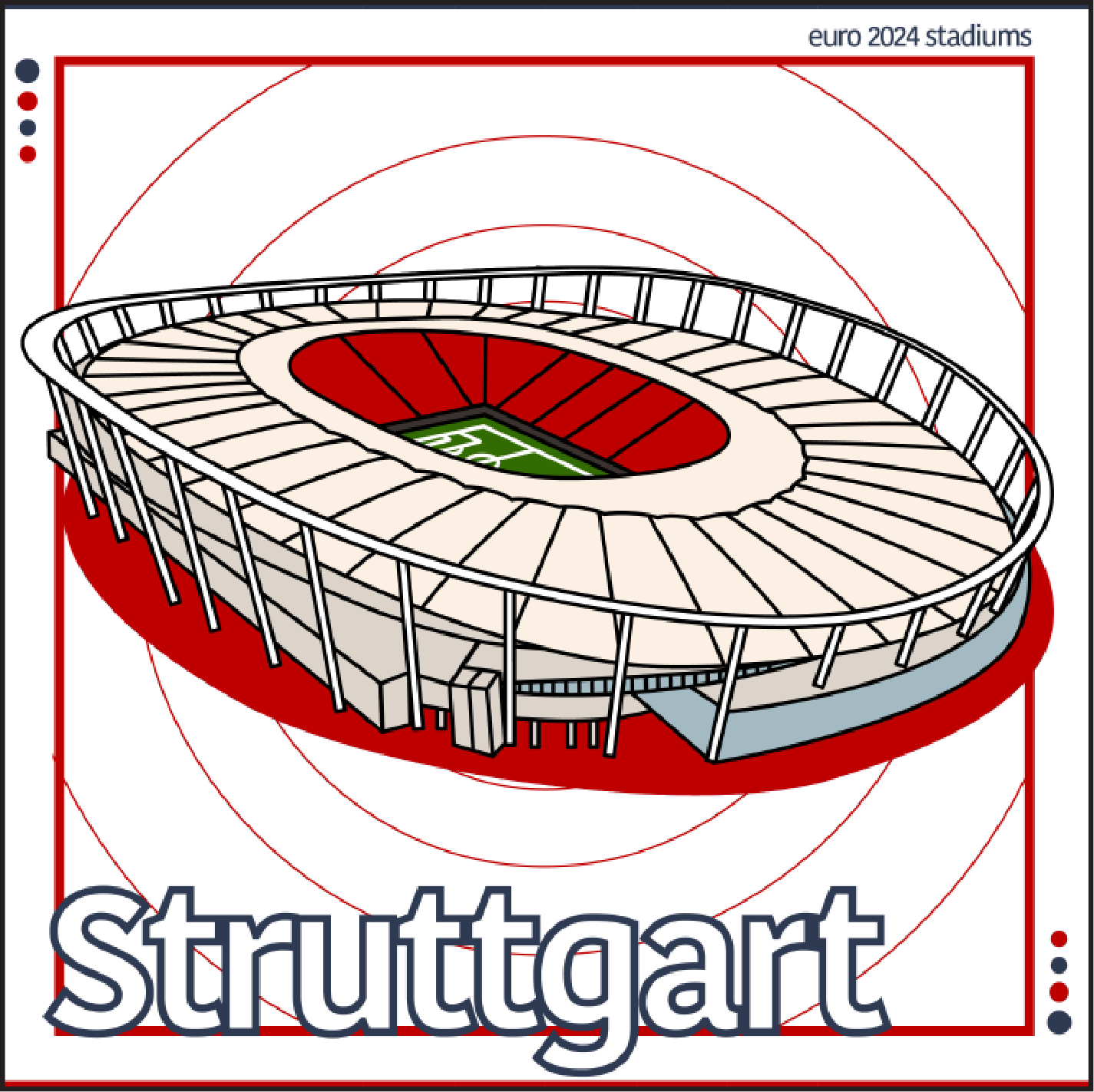
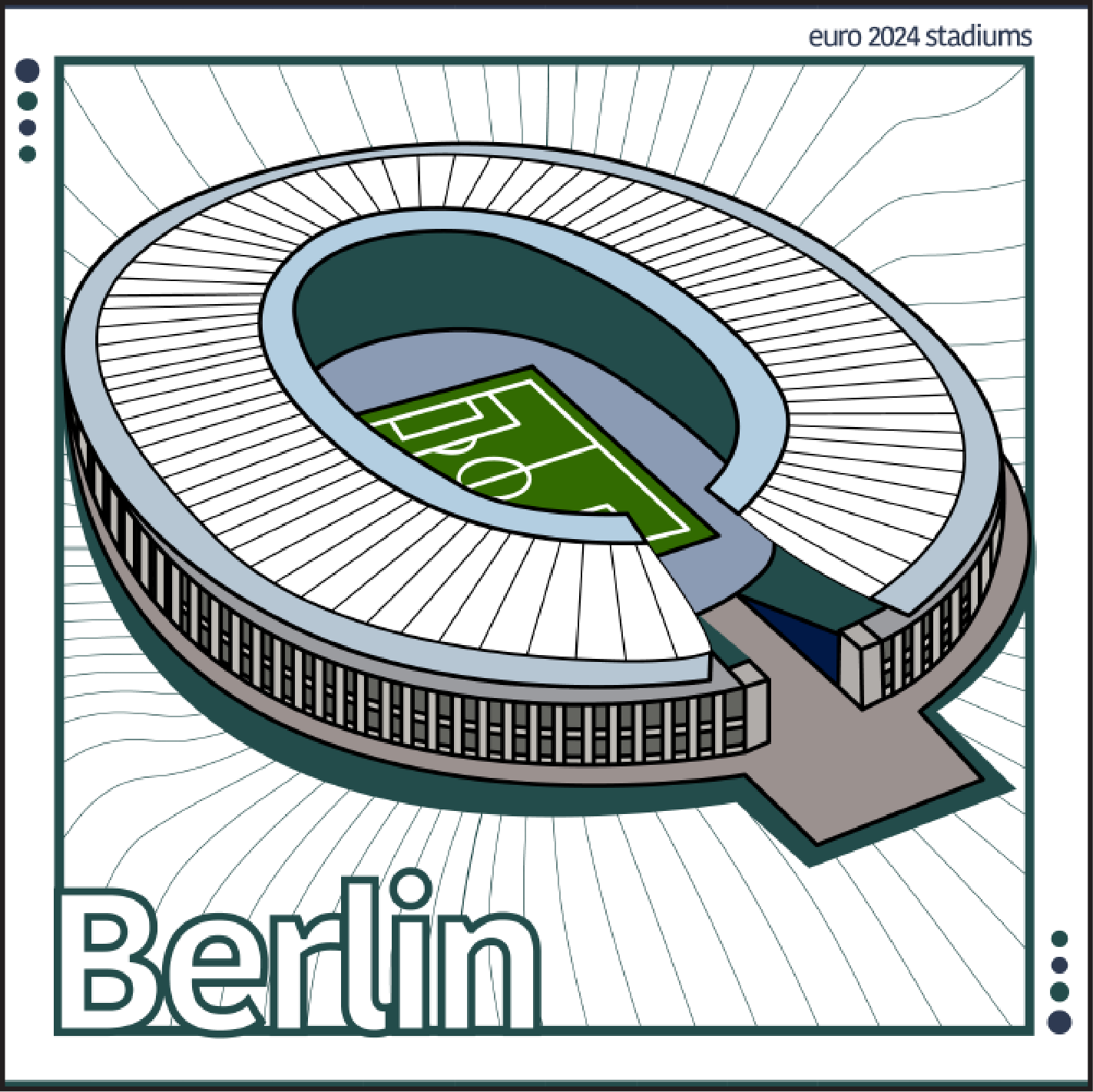
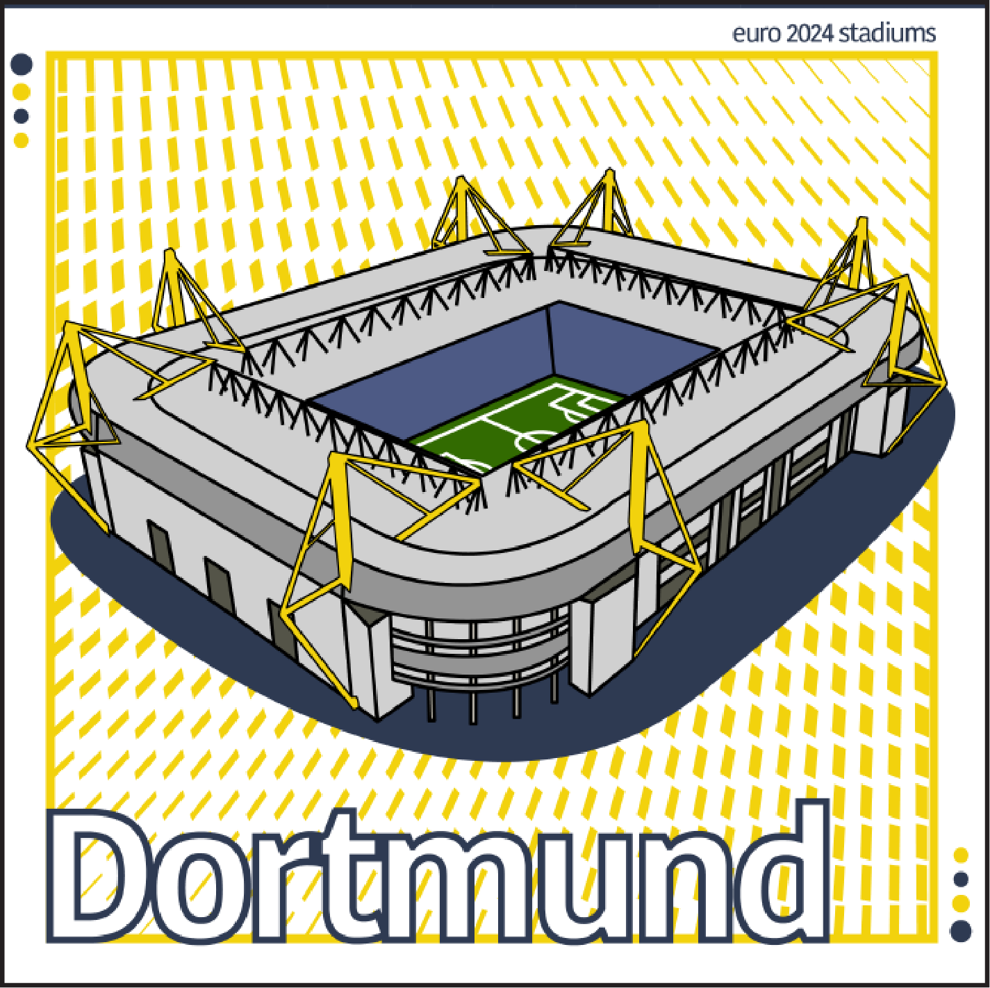
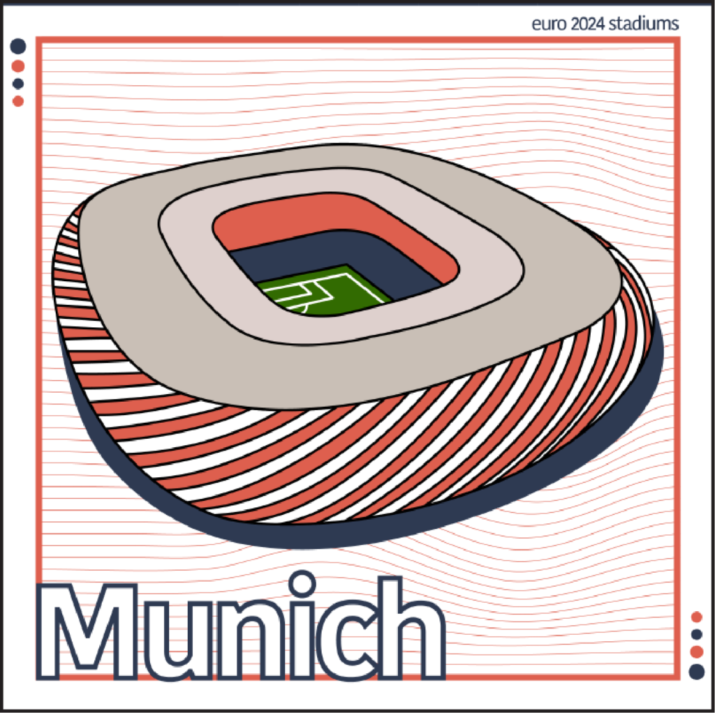
0 %

Swiss Posters

The Concept

This project was an exploration of Swiss design principles, focusing on grid structure, typographic hierarchy and minimal visual distraction. The aim was to experiment with a more disciplined, structured style and push my layout decisions beyond instinct into intentional system-based design.

Client

University of Greater Manchester

Services

Swiss Style

Date

April 2025

Challenge

My usual work leans toward expressive, bold and energetic visuals. The challenge here was restraint working within strict grid alignment, controlled colour palettes and carefully balanced typography without relying on heavy graphics or decoration.


Outcomes

The final posters demonstrate clarity, rhythm and hierarchy through strong type, asymmetric balance and deliberate negative space. This exploration strengthened my understanding of structure and precision, influencing how I approach layout systems across branding and digital projects.